TractionRec: Simplifying a complex Salesforce platform
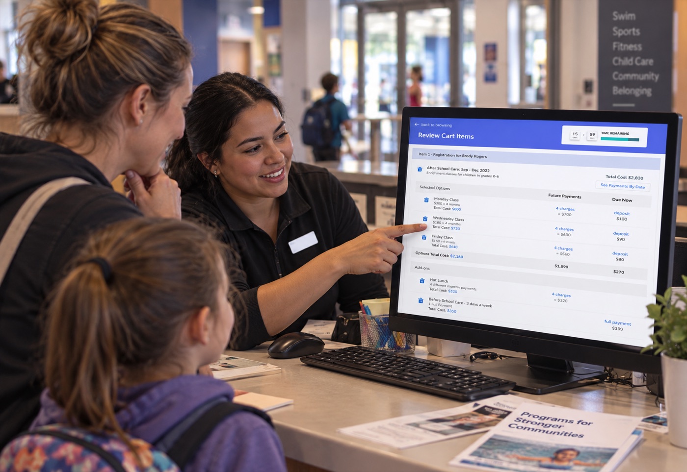
TractionRec supported more than 43 community centres across the U.S., including the YMCA of Delaware, where 5,000 employees relied on the platform daily.
The system supported thousands of members purchasing memberships, registering for programs and managing payments.
I redesigned critical workflows to make this complex Salesforce platform easier for staff to learn and use.
- Role
- UX/UI Designer, sole designer
- Product
- Salesforce web platform
- Focus
- Research, workflow design, usability testing, design systems
01 · The problem
Six months to onboard
TractionRec had grown through engineering led development without dedicated product design.
Over time, core workflows became difficult to learn, and onboarding a new organization could take up to six months.
Key insight
The issue was not a single screen.
Memberships, registrations, childcare, scheduling and recurring payments were connected, so improving one flow required understanding the system around it.
02 · Discovery
Find where users struggled most
I combined team knowledge and product data to identify recurring problems and where design could have the most impact.
-
Interviews
I interviewed six team members to understand customer problems alongside business and technical priorities.
-
Data review
Salesforce analytics and Jira tickets showed where users were getting stuck most often.
-
Workshops
Four internal workshops surfaced product knowledge and decisions that had not been documented in one place.
-
Opportunity mapping
I mapped existing functionality, pain points and opportunities across key workflows to make problems visible and comparable.
03 · Prioritization
Focus on cart and checkout
I worked with the team to compare user needs, business value and technical effort.
Cart and checkout became an early priority because many important transactions came together there.
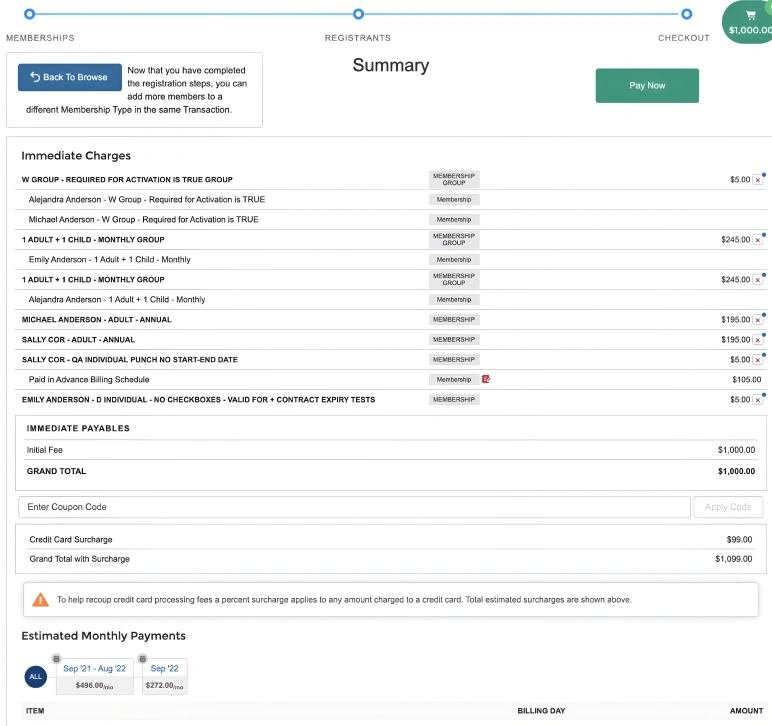
The existing experience had several problems:
- Important information was difficult to scan
- Credits and gift cards could not be easily applied
- Donations were not supported in the cart
- Future payments were difficult to understand
- Checkout moved users to a separate payment page, where closing the browser could leave future payments incomplete
04 · Design constraints
Design within Salesforce
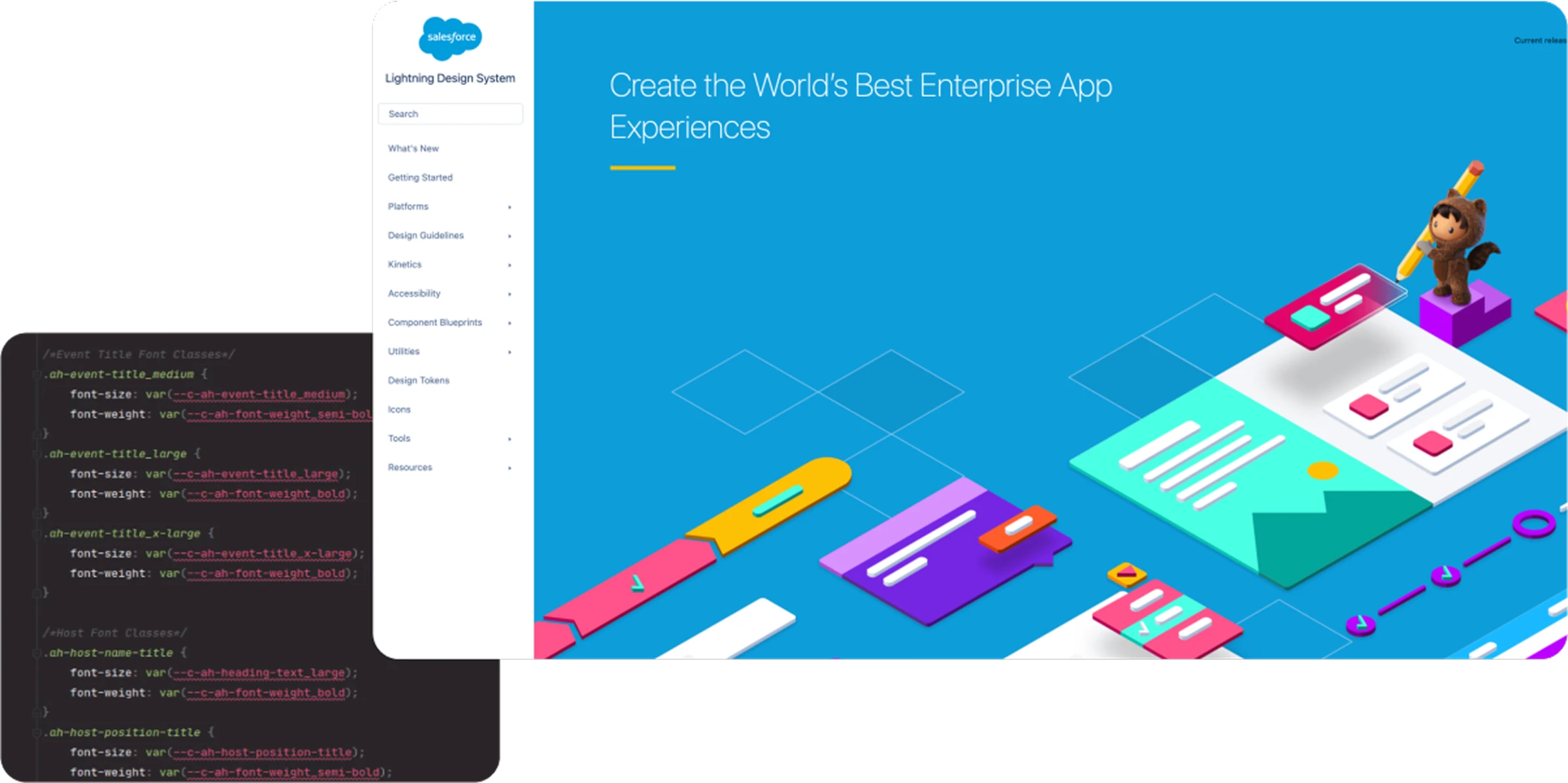
The redesign had to work within Salesforce and its Lightning Design System.
I learned its components, tokens and variables so the experience could improve without creating solutions that Engineering could not realistically build.
05 · Design evolution
Add complexity only when users need it
I started with the simplest transaction and expanded the experience as testing revealed additional needs.
-
Start simple
A clear one time purchase with an easy to understand total and donation option.
-
Support everyday transactions
Added memberships, present and future payments, discounts, credits, coupons, gift cards and donations.
-
Support complex purchases
Added multiple classes within a program, visible future charges and control over individual items without making simple transactions harder.
06 · Outcome
Create a clearer foundation
I left TractionRec before every initiative reached production, so I do not claim final business results from work that had not fully shipped.
The research gave the team a clearer view of where the platform needed improvement, while the tested designs showed how complex transactions could become easier to manage within Salesforce.
This work also established the research and discovery practice that became central to how I approach product design.
- 6 monthsLongest onboarding time before this work
- 6 interviewsTeam members included in discovery
- 4 workshopsInternal product knowledge sessions
- 43+Organizations using the cart and checkout experience